Checkmate: A budget app
Checkmate is a budget app developed for households who need to manage their finances to easily set and track financial goals.
Dashboard in motion
The team
UX Designer (myself)
Developer
The tools
Figma
Jira
Miro
Pen and paper
Data into design
I was approached for this project because the developer had created API and backend code for a budgeting platform, and wanted to collaborate in creating the user interface.
It was my job to turn data into design.
Keep it simple
For this sprint, I needed to keep the designs simple in order to create an elegant and clean design to quickly get the product into the users’ hands.
Checkmate Dashboard
A closer look at the culmination of ideas that resulted in a dashboard with readily available information
Design Decisions and Details
Checkmate dashboard before first handoff
Header navigation- User can easily move through the platform and utilize the avatar to edit account details
Sidebar navigation-Designed for eventual single-page application and provide additional resources for users to navigate the platform
Cards-Provide a quick snapshot of outgoing and incoming financial details.
Donut chart-Provides user with a visual, interactive representation of their finances
Additional visual elements:
Design system
Color: Chosen to elicit a feeling of calm and peace and for the clean, simple aesthetic.
Typography: We chose a typeface that was complimentary to the logo. It also needed to be clean and easy to read.
Inspiration and research
Competitive Analysis: I researched financial and budgeting platforms such as Mint, Capital One, Vanguard, Honeydue, and spreadsheets sold online to understand how users would use certain features and how they would be visually displayed on our app. Below are some examples of inspirational features:
Vanguard
This example is where I drew inspiration for the dashboard and visual displays of information the user would want to quickly view. It shows a dollar amount toward a goal, a graph showing progress and individual cards that can be personalized for individual goals.
Capital One
I imagined using cards as containers for information users can quickly access to see a snapshot of their progress toward accomplishing financial goals. In this case, the cards are a carousel that the user interacts with to switch through and choose the information they want to view.
Mint
Mint Mobile presented the most design inspiration. In this image, the user can see how close they are to accomplishing their goal with the status bar, a dollar amount ($209 of $300) and the amount left until their achieve their goal. I wanted to include this somewhere in our app because it was clean, visually appealing and let the user see in plain terms how close they are to their goals.
Sketches and ideation
What led to the creation of the Checkmate’s interface?

Image of the whiteboarding session held between developer and designer to visualize the dashboard.

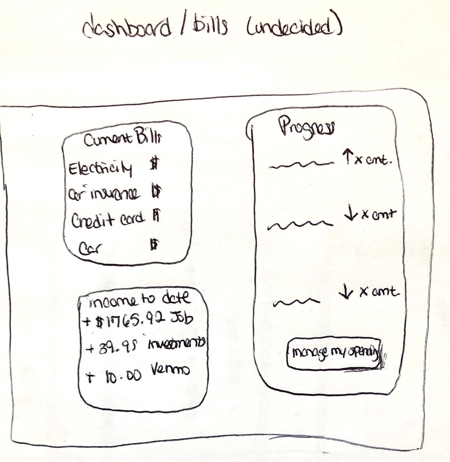
Early ideation for presentation of data on dashboard

Suggestion for data input and managing expenses in an organized way

Sketch illustrating how subscriptions could be managed in Checkmate. This was not considered for the first iteration of the project.

Ideation for displaying bills and expenses. A calendar was imagined to help users plan for the upcoming due dates.

I asked my developer to design a form that included the information that they had built. This is what they sketched.
Technical Considerations
A budgeting app works best when the user can input their information
The data used in this case study was manually created by the developer. Because of this, we had a small data set which created some constraints for designs and user flows during this sprint.
How might we make it easier for people to understand their budget?
Expenses- It was important for the user to be able to view all of their expenses in dollar amounts so they could easily understand where their money is going.
Amount Budgeted-The user has the ability to set the amount they plan to spend on recurring expenses and variable expenses so the user can set their financial goals and change them as needed.
Amount Spent- The user can enter the actual amount they spent on bills for the month. In future iterations, the database will generate the difference between the budgeted amount and amount spent so the user doesn’t have to do any of their own math to know how much money they have left.
Edit My Expenses Button- I created a button to give the user a visual cue to know that they can make changes to their expenses and the amount of money they want to spend each month. This is just an idea at this time and will likely change as we iterate on how we want to guide the user through setting up and editing their budgets.
Designing around technical limitations
In the “bills” section of Checkmate, we have to capture the monetary values and allow the user to forecast how much money they will have left over.
The images show the presentation of the data for the users
In this case, I am designing around the data. It’s important to us that the user has a good experience and the way to do that is to capture the data and use it correctly.
Challenges during this project
Accessibility
I worked closely with the developer to ensure that we were thinking about accessibility throughout the design process. We acknowledge that we still have work to do in order to accommodate assistive devices but contrast was something I considered from the very beginning.
Responsivity
As I created wireframes in Figma, I designed features to a fluid grid. Responsive designs were a challenge for both myself as a designer and for the developer. While there is still more work to do, to be responsive to mobile and tablet devices, we are satisfied that for now our designs are responsive when using a desktop.
UX ideas and developer limitations
As a UX designer, I was primed for creating user flows and considering user interactions. This project was particularly challenging because the data was already created. I wasn’t working to turn design into data. As such, we created a list of ideas for future ideations.
What’s next
More data
The goal is to create additional data so we can build a feature to allow users to set financial goals and track their progress. We can’t do this if the data doesn’t exist.
Expand the tool
We plan to quickly build a feature to allow users to set and manage their financial goals. This includes gamification and indications when they accomplish a goal. We have started sketching and talking about what this will look like and how it might function.
Increase fidelity of the design
The screens that I have designed so far and that have been built to be functional are very basic. I plan to adjust the size and content of the cards on the dashboard to better utilize the white space. I will continue to consider user flows and interactions of the data on the dashboard and on the expenses management page.
Key Takeaways
I get to keep learning! This process was a growing experience and I had the opportunity to learn from the developer and gain insights that I wouldn’t have otherwise had. I can’t wait to continue to work on this project. This is only the beginning.


